Fonte Kenteken Smits par LeFly Fonts
Vous êtes sur la page de la fonte Kenteken Smits. Elle a été créée par LeFly Fonts.
C'est une fonte gratuite. Vous pouvez l'utiliser sans aucune restriction. La fonte a été publiée sur Fontzzz.com, le 25.02.2023 à 16H 47M. Elle a été placée dans la catégorie "Recherchées - Rétro". Version de la fonte Kenteken Smits - "Version 1.000". Vous pouvez télécharger la fonte Kenteken Smits sans aucuns frais et sans insription en cliquant sur le lien "Télécharger la fonte". Pour votre confort, cette fonte a été compressée en Zip. L'archive contient 2 fichiers de fontes.
Commentaire de l'auteur
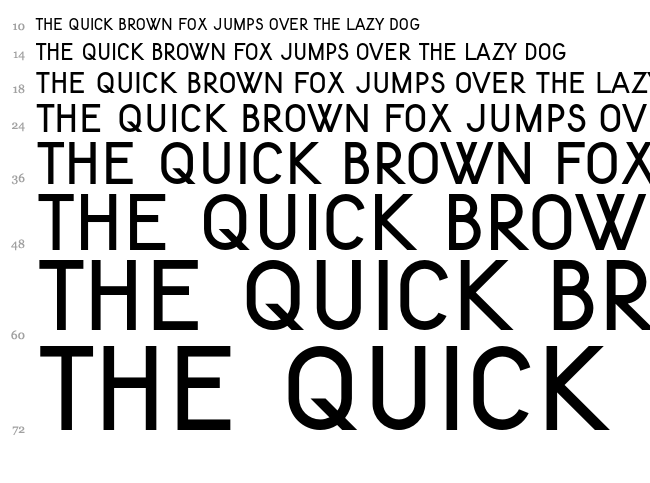
The 'Kenteken Smits' set of fonts represents the typography as used on vehicle license plates in The Netherlands between 1951 and 1979.
I was asked by the webmaster of nummerplaten.info to develop the original drawings from 1937 into a font. These originals were designed by mr J.B. Smits, director of the Amsterdam Institute for Applied Arts Education (Instituut voor Kunstnijverheidsonderwijs).
The name of the font set is in recognition of the original designer.
I ended up developing three versions.
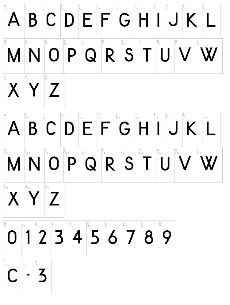
'Kenteken Smits 1937' is a bare representation of the design as shown in a 1937 report on legibility of the design. It lacks C, O, I, Q and Y (these were not to be used on license plates). The character spacing is also as per the original design, i.e. suitable for producing license plates. This version is the most historically accurate of the three.
NOTE: Due to the 'incomplete' character set, 'Kenteken Smits 1937' will not be included in the publicly available download (just use 'Kenteken Smits 1951' instead, see below).
I'll give you this font if you make a voluntary donation through DaFont, though!
'Kenteken Smits 1951' is the font as it was finally used on actual license plates from 1951 onwards. Most notably the character '3' changed form. It also contains 'C' and 'O' which were added in later years to accomodate special issue plates (diplomatic and military). For good measure I completed the character set myself with an 'I', 'Q' and 'Y'. Spacing is still utilitarian. This is the version I recommend for 'typesetting' license plate mock-ups.
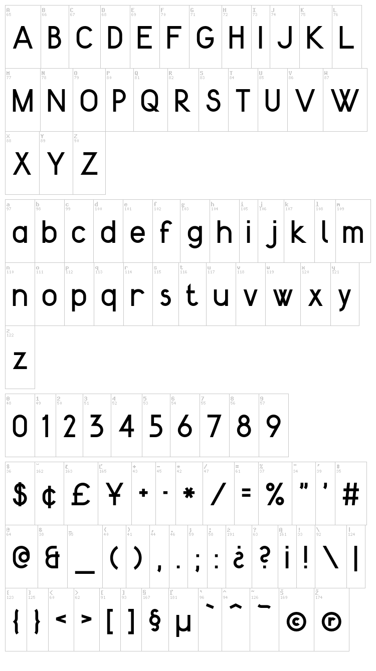
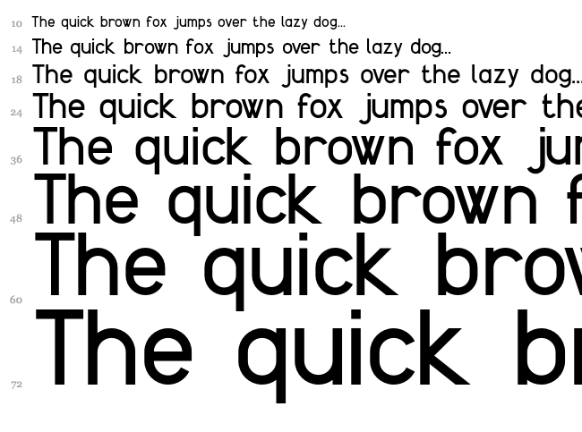
Finally, 'Kenteken Smits 2013' is a heavily expanded version. It contains a complete lower case set, accented characters, punctuation etc. Also the spacing has been adapted to accomodate other uses than 'plate setting'. For anything other than license plate mock-ups, I reccomend using this version.
These fonts are governed by the Creative Commons License: Attribution-ShareAlike 3.0 Unported (CC BY-SA 3.0) [http://creativecommons.org/licenses/by-sa/3.0/]
This means: free to distribute and free to use for typesetting any work (including commercial) without an additional license. Please keep this Read Me file with the original fonts when redistributing.
New fonts developed, derived or remixed from these designs can only be shared under the same license.
Feel free to contact me (lefly.fonts@gmail.com) for any questions regarding this font.
I also love to see how you use these fonts!
Enjoy,
Arthur
Prévisualisation
Carte de la fonte
Cascade
Prévisualisation
Carte de la fonte
Cascade
Plus de fontes:
Auteur: Gravual
Ajoutée:
2012-06-10
Visualisations:
3716
Téléchargements:
109
Auteur:
Ajoutée:
2021-10-06
Visualisations:
1808
Téléchargements:
61
Auteur: imagex
Ajoutée:
2020-04-13
Visualisations:
1912
Téléchargements:
83
Auteur: justme54s
Ajoutée:
2013-07-13
Visualisations:
7826
Téléchargements:
402
Auteur: Fontourist
Ajoutée:
2023-10-08
Visualisations:
365
Téléchargements:
10