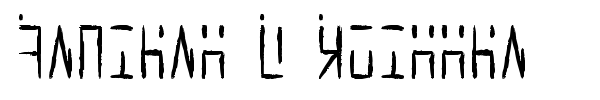
Fonte Ancient G Written par Gen Aris
Vous êtes sur la page de la fonte Ancient G Written. Elle a été créée par Gen Aris.
C'est une fonte gratuite. Vous pouvez l'utiliser sans aucune restriction. La fonte a été publiée sur Fontzzz.com, le 21.03.2012 à 07H 57M. Elle a été placée dans la catégorie "Dingbats - Autres". Version de la fonte Ancient G Written - "Version 1.00 October 2, 2008, initial release". Vous pouvez télécharger la fonte Ancient G Written sans aucuns frais et sans insription en cliquant sur le lien "Télécharger la fonte". Pour votre confort, cette fonte a été compressée en Zip. L'archive contient 1 fichiers de fontes.
Commentaire de l'auteur
A variant of the ANCIENT glyphsets used by the Ancients in Stargate: Atlantis.
This version is designed to provide a HANDWRITTEN variant of ANCIENT G MODERN, which is my extended character version of the machine-print styled revision of ANCIENT.
The purpose with this revision, as in Anc. G Modern, is to CREATE PUNCTUATION and ADDITIONAL CHARS/SYMBS to facilitate better clarity when applying this font to English documents which contain punctuation and other characters. Of course, this WRITTEN variant stylizes the glyphs to facilitate hand writing them more readily. Some glyphs here are more identical to the source than is possible with others but hopefully, once used a bit, will become intuitive for those familiar with Ancient and or Ancient G Modern.
Per show canon, the Ancients did not appear to use punctuation marks, nor did they distinguish between Upper/Lower case. Again, to facilitate use of this font in regular documents or even as the Windows font (for menus etc) I have created CAPITALIZED VARIANTS which are identical to the lower case except I added a SQUARE DOT FLOATING ABOVE TOP LEFT of CAPPED KEYS. Passwords and user names sometimes use L/case and U/case letters, so it is necessary to distinguish the 2 cses in daily life here on Earth!
My logic for the design of new characters is as follows:
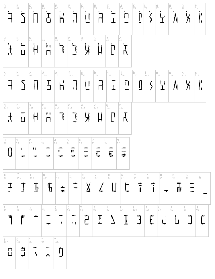
Letters are made up of white/black blocked spaces dividing on a 3 wide by 4 high grid. A few letters make use of subdivsions within the grid.
In canon, all numerals share a centered descender "tail" unlike the letters.
I took this further, by giving all punctuation mark glyphs a centered ascender on top, like an upside down version of the numeral tail -- an "antenna" if you will. This should make it easier to become facile at visually distinguishing punctuation marks from letters or numbers.
Some punctuation marks or symbols are used in numeric/math contexts partly or wholly. So, math or number oriented and shared alphanumeric/math punctuations are given the "tail" of numerals and the "antenna" of punctuation/symbols to so indicate the context.
The numbers, in canon, have a slightly more subdivided or even an altered grid used in their design than do the letters. Here, as well, both numbers and punctuation/symbols share this more prominent use of subdivision or underlying grid different from the letter glyphs.
Overall, I tried to adhere to the digital, techno-sensibility of the glyphs as seen in SG-1 and SGA while striking a balance with variations of weight and tone so as to be reasonably attractive, while remaining aware of the need to make this practical and functional. How well I fared toward my goals, I leave to you to decide. :)
Gen Aris
genaris@gmail.com
Prévisualisation
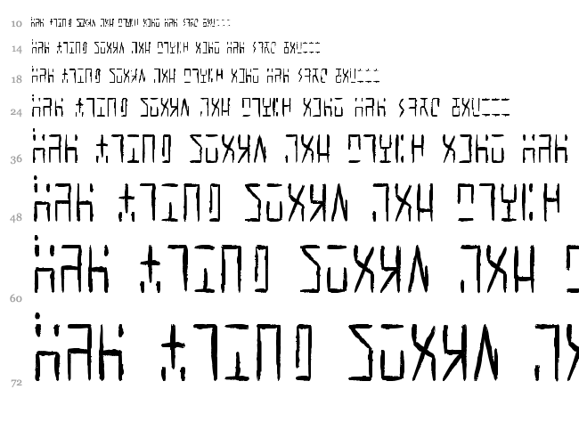
Carte de la fonte
Cascade
Plus de fontes:
Auteur: Manfred Klein
Ajoutée:
2013-05-26
Visualisations:
3630
Téléchargements:
115
Auteur: Font Environment
Ajoutée:
2013-06-22
Visualisations:
3808
Téléchargements:
88
Ajoutée:
2013-11-03
Visualisations:
3458
Téléchargements:
84
Auteur: Gary David Bouton
Ajoutée:
2012-02-22
Visualisations:
3912
Téléchargements:
121
Ajoutée:
2012-11-03
Visualisations:
4007
Téléchargements:
112